UX Feedback - a better way to search through multiple versions is needed.
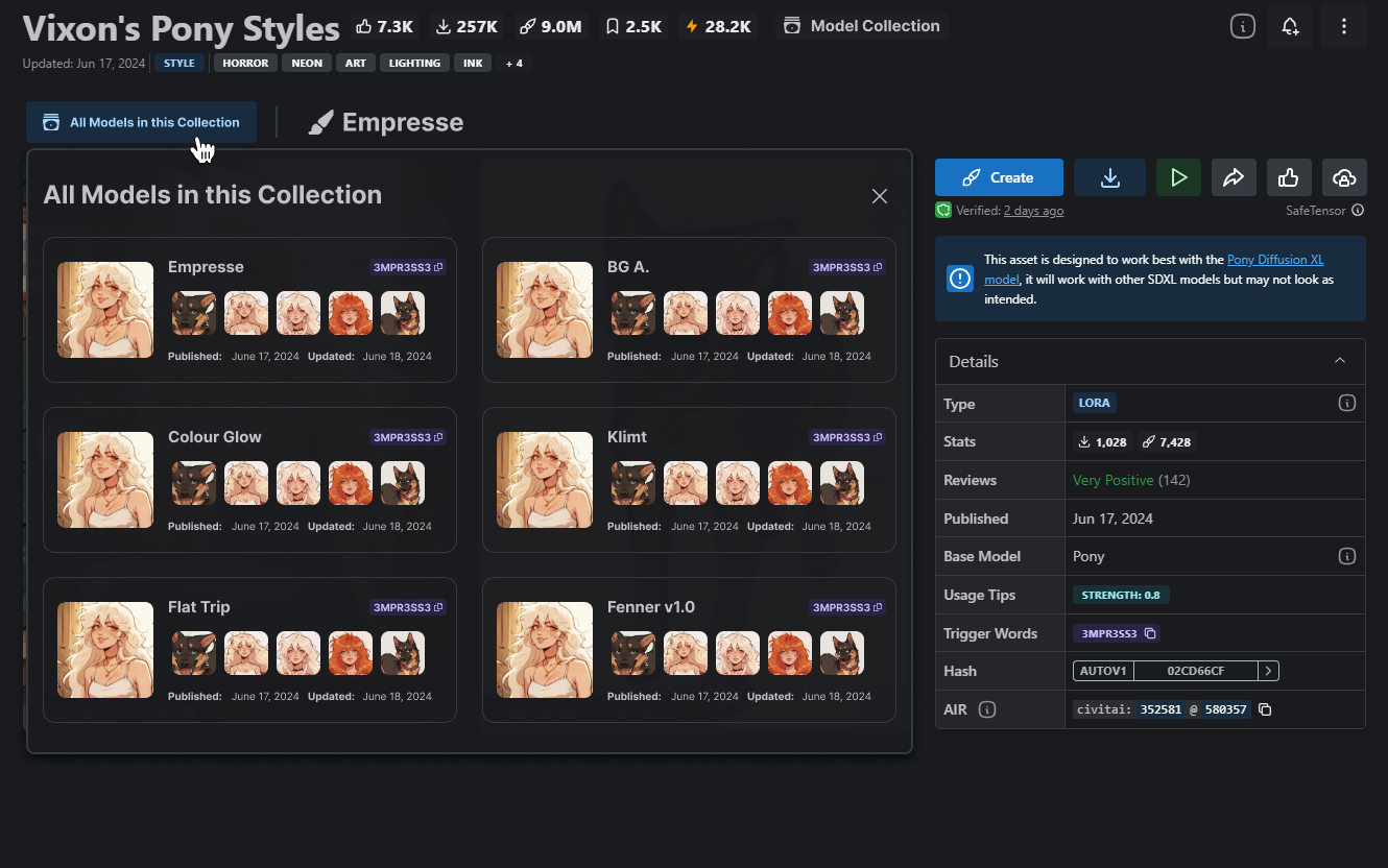
From my understanding, many creators have taken to using the "version" feature to upload lots of separate models on one page. A good example would be Vixon's Pony Styles.
The browsing experience for all of these versions is extremely tedious - the only immediately apparent way to move between them is a carousel along the top that offers nothing but the name of the model and only moves models one click at a time.
As a UX designer myself, I'd propose a few options:
1) create a distinction between model "versioning" and separate entries of these "collections." I don't know if model versioning was intended to be used the way people have started to use it, but it needs to be addressed regardless. Creating a sort of "Model Collection" page that would allow creators to have one landing page with dozens of different models could alleviate this issue, as well as preserve the ability for those individual models to be properly versioned.
2) Ditch the carousel for clicking through models. Given that this medium is entirely visually based, you could go with some cards and previews for easier navigation of the models. (I think this approach should be looked at even if the versioning system is unchanged) I've attached a concept of what I'm talking about that I mocked up in figma - bear in mind that I did it quickly just to get the point across which is why the pictures are all the same, I can't be assed to actually switch all the pictures unless you wanna pay me to do UI for you)
Please authenticate to join the conversation.
Awaiting Dev Review
💡 Feature Request
Almost 2 years ago

boes_lks
Subscribe to post
Get notified by email when there are changes.
Awaiting Dev Review
💡 Feature Request
Almost 2 years ago
boes_lks
Subscribe to post
Get notified by email when there are changes.