Proposing change of Lora Training Overview
I propose replacing the current tabular layout with a grid layout.
Current Layout: The current layout displays processes in a table format. This layout becomes cluttered and hard to manage when there are many processes, making it difficult to quickly find specific information.
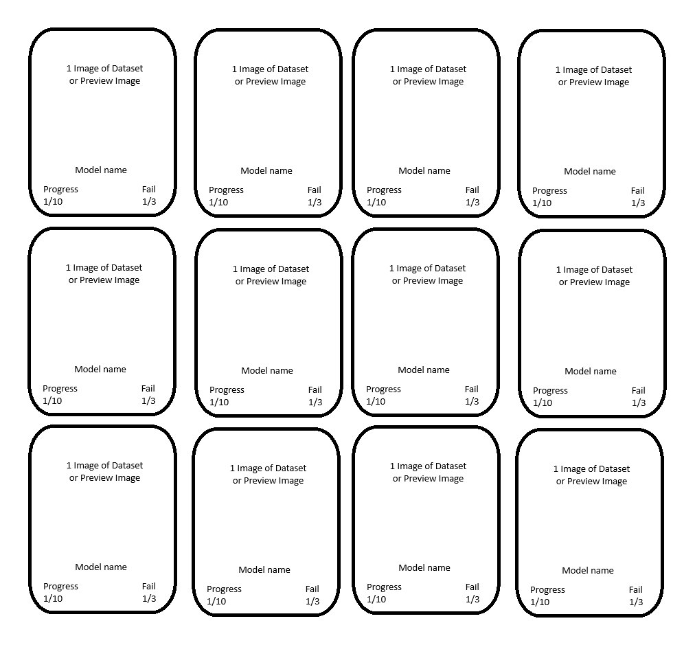
Proposed Layout: The proposed grid layout would display each process in a separate card. This would allow for a cleaner, more organized view that can easily scale to accommodate more processes.
This change would provide the following advantages:
Better Scalability: The grid layout can handle more processes without becoming cluttered.
Improved Clarity: Each process is clearly separated, making it easier to distinguish between them.
Enhanced Aesthetics: The grid layout looks more modern and appealing.
Responsive Design: The layout adapts better to different screen sizes, making efficient use of space.
I have included a rough sketch in the attachment. I am not an expert in Paint, but it should illustrate what I mean.
Advantages of the Grid Layout over the Tabular View
Better Scalability:
Manage More Processes Simultaneously: The grid layout allows for displaying many processes at once without requiring the user to scroll excessively.
Visual Relief: By distributing information across multiple cards, the user’s eyes are less strained, even when many processes are displayed simultaneously.
Improved Clarity:
Visual Hierarchy: Each process is contained within a separate card, making it easier to distinguish between individual processes at a glance.
Easy Identification: Key information, such as progress or error messages, can be visually highlighted within the cards, facilitating quick identification and prioritization.
Aesthetic Enhancements:
Modern Design: A grid layout looks more modern and appealing, enhancing the user experience and presenting a more professional appearance.
Design Flexibility: Cards in the grid can have different designs and colors to highlight different statuses or importance levels.
Responsive Design:
Adaptation to Different Screen Sizes: The grid layout adapts more easily to various screen sizes, benefiting users with different devices (PC, tablet, smartphone).
Optimal Space Utilization: The layout can dynamically adjust to the available screen width, making efficient use of the available space.
Interactive Elements:
Easier Interaction: Interactive elements such as buttons, progress bars, or status indicators can be more clearly and user-friendly integrated into the cards.
Direct Actions: Users can perform actions directly within the cards (e.g., pause, cancel) without needing to scroll through a long list.
Faster Information Absorption:
Compact Display: Key information can be compactly and clearly summarized within a card, increasing the speed of information absorption.
Clear Separation: Each process is clearly separated from others, preventing confusion and making navigation easier.
Please authenticate to join the conversation.
Awaiting Dev Review
💡 Feature Request
Almost 2 years ago
AsaTyr
Subscribe to post
Get notified by email when there are changes.
Awaiting Dev Review
💡 Feature Request
Almost 2 years ago
AsaTyr
Subscribe to post
Get notified by email when there are changes.